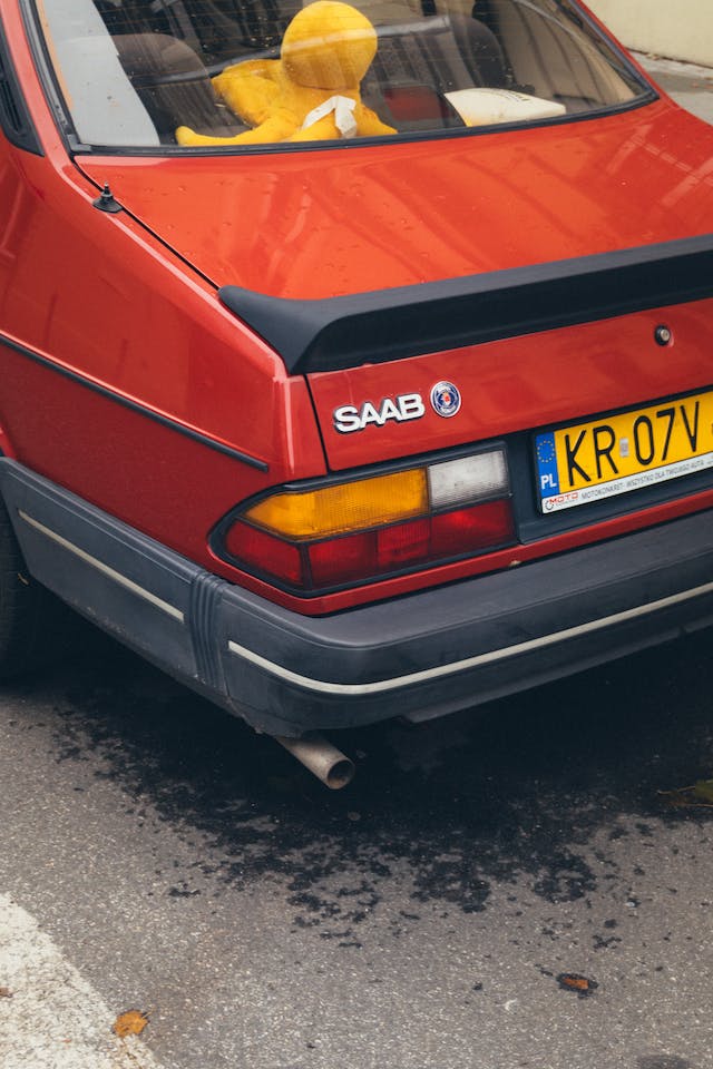
Founded in Sweden in 1945, Saab Automobile AB is a car manufacturer. Saab stands for Svenska Aeroplan Aktie Bolag. It began when its main company, Saab AB, started to a project to build and design small automobiles. Their first car, the Saab 92, was presented to the public in 1949. The company decided to merge with Scania-Vabis in 1968 and after ten years, the Saab 900 was introduced and the car became Saab’s best-selling model at that time.
Since then, Saab earned a reputation for luxury and reliability. Their cars have been characterized by quality workmanship, clean lines, and a signature head logo. Over the years, the logo has gone through some alterations but nevertheless, it remains a distinctive part of Saab’s automobiles. This is why we are going to unlock the history of this iconic design and see why it has been so effective.
History
Although the creature in the logo is often associated with Saab, it has been used by Scania since the start of the 20th century. The animal we see on the Saab logo is based on a mythological creature that has the head of a bird and a body of a lion and it is called the Griffin. It can also be seen on the official coat of arms of the Count von Skane, the emblem for the Swedish province Skane where Saab was founded.
The emblem with the griffin was not used on Saab’s cars until 1984. It was Carl Frederik Reutersward, the designer of the emblem, who thought of the idea to innovate the logo’s appearance. He said that the griffin symbolizes vigilance and the two overlapping circles was altered to form a cylindrical band and create an impression of movement.
Saab used the emblem with the Griffin until 2010. This was because Scania has always been protective of their logo and General Motors had rights to use the emblem with the griffin design for only twenty years after they acquired the company in 1989.
The Design
Saab started as an airplane manufacturer, that’s why their early car emblem featured the name Saab that is written over a stylized shadow of airplane wings. But once Saab began mass producing cars, they decided that they needed a simpler logo. That’s why in 1974, they opted for the logo that contained a griffin head inside of two overlapping circular lines.
The old Saab logos featured the colors red, gold, blue, and white. But when they started to focus on making cars, Saab decided to simplify the emblem’s color scheme to a sleek silver and navy blue design which looked futuristic and crisp. But come 1950s, the emblem’s design looked a little plain that’s why they decided to add in the red and gold color again to make it more vibrant and colorful.
Even if Saab went through bankruptcy and change of ownership several times, it is still has a devoted following in the car industry. And one good reason why Saab has a continuous positive reputation is their stylish logo. The use of the griffin head on their emblem does a good job of emphasizing the company’s Swedish roots but at the same time, it matches the minimalistic style of their cars.
