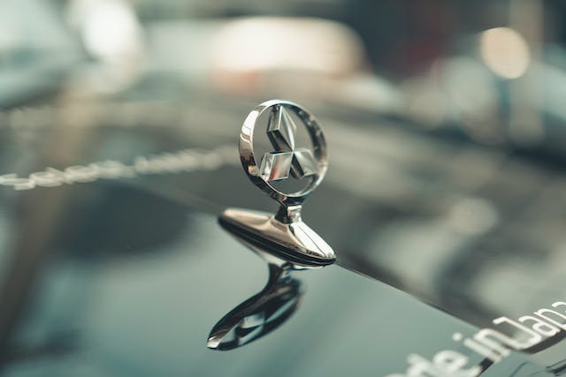
Mitsubishi is a Japanese multinational car manufacturer in Japan. Their name comes from the Japanese word Mistu which means three and Hishi which means chestnut. One-third of Mitsubishi is owned by Nissan which makes them a part of the Renault-Nissan-Mitsubishi Alliance. Mitsubishi started out as a steel supplier to the Japanese Navy and today, Mitsubishi is composed of different companies that vary in specialization such as banks, chemicals, aircraft, and plastics. But they are widely known for manufacturing commercial and passenger vehicles. They are also the first company that introduced Japan’s first four-wheel-drive car. Today, Mitsubishi products are sold in over one hundred and forty nations worldwide.
Mitsubishi’s logo is simple but hard to understand. It has a few elements and basic colors that doesn’t seem special. But, it does immediately catch the attention and interest of the consumer. Even though it looks minimalist, it never fails to show the branding of the company and it works an image that strikes out the consumer. Mitsubishi’s logo evolved throughout the years and it proves why logos are important in the marketplace.
History
The inspiration for Mitsubishi’s logo came from the founder of the old Mitsubishi organization, Yataro Iwasaki. He chose the three-diamond design for the logo of his company because he said that the three-leaf was the crest of the Tosa Clan, Yataro Iwasaki’s first employer. It also symbolizes three-stacked rhombuses of his own family’s crest. Mitsubishi’s emblem also influenced other Japanese automobile manufacturers. In fact, you can see its design elements on Honda and Toyota. Mitsubishi’s logo simple shapes and colors also influenced other international car brands who also opted for a minimalist and updated design.
The Design
The original Mitsubishi emblem looked like the logo we see today. The triple diamond design has been the company’s logo since the 1870s but back then it was in much thinner form. Mitsubishi decided to change their logo into larger diamond shapes so that when they are on a vehicle, they are easier to see and identify at a distance.
The color of the logo has always been red, again this is most likely because it is easier to identify the logo at a distance. But Mitsubishi often uses the blue color for its wordmark, especially in their native market. The color scheme of Mitsubishi’s logo helps form a unified image within Asia.
Mitsubishi’s emblem is proof of a truly classic design. it showed that with only a few alterations, what worked from the past can make its way to the modern era. Their logo has set a prime example of modernization and if you want to know how you can take a design from the past and bring it to the present, you just have to look at Mitsubishi’s emblem.
