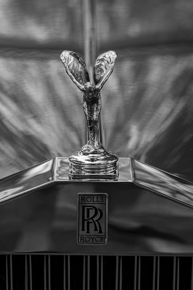
“Small things make perfection, but perfection is not a small thing.” – Sir Henry Royce, Rolls-Royce co-founder
This sentiment continues to be true for Rolls Royce, as they continue to focus on their brand with the recent change in the logo to create a new visual identity for the brand. Rolls-Royce no longer sees itself as only an automaker, but instead a “house of luxury.” Some people still mistake the Rolls-Royce badge and the Spirit of Ecstasy flying lady hood ornament for something else, so the 116-year-old carmaker decided to put an end to it by redesigning their logo.
Why the Change in Design?
Rolls-Royce wants to announce its new brand identity, and they can do it by modernizing the marque. If they want to be recognized as a “House of Luxury,” they needed to make some modern and elegant changes.
They also want their new visual language to resonate with younger clients. It’s not that the signature monogram and the iconic Spirit of Ecstasy logo will be abandoned. They were just fine-tuned to resonate with a younger demographic since, at present, the age of Rolls-Royce clients has reached the global average of 43 years of age. This shift has been brought on, in part, by the edgier and more performance-oriented Black Badge model options they released in 2016. The more digital-friendly logo creates a more abstract and fluid expression of the symbol.
According to Rolls-Royce Moto Cars chief executive TorstenTorsten Müller-Ötvös, “We have embarked on a fascinating journey of modernizing our brand identity to echo those changes seen in our portfolio, our client demographic, their lifestyle and the luxury world that surrounds them.”
What Changed?
These are the details that have been revised regarding Rolls-Royce’s visual branding:
1. Spirit of Ecstasy logo
Designed by Pentagram, the new Spirit of Ecstasy symbol has been flipped to face the right, as if looking ahead. Details are pared back to make it more minimal yet bolder in appeal. The new symbol was designed with digital in mind since the former logo was too complicated. The designers also reduced the number of reflective marks and added a very thin base under the figure’s feet to clarify that it’s a statuette and not an actual person. The size of the waist, the shape of the wings, and the detailing on the face of the figure have been carefully detailed so as not to send the wrong message. The current design has gone through 11 main iterations, and the current version was reduced in size.
The Spirit of Ecstasy ornament adorned the bonnet of every Rolls-Royce model since 1911, but the “RR” monogram marks the company’s identity itself. It will also replace it as the company’s main symbol, designed to embody luxury, style, beauty, and perfection. The new Spirit of Ecstasy ornaments is supported by a spring-loaded mechanism to automatically retract if the car gets hit.
The Spirit of Ecstasy expression, an avant-garde reinterpretation of the emblem generated by a computer code, can be used fully or partially in printing, engravings, and embroidery, and digital displays. This icon has also been reproduced in a more abstract way as an illustration of silken fabric. It was achieved by inputting various codes into a processor to make a new pattern made up of parallel lines that curve and overlap to mimic the shape of the female figure.
The new Spirit of Ecstasy logo has become more contemporary in design, but it still remains recognizable.
2. Signature color
Pentagram incorporated a deep purple hue as it represents royalty, wealth, and power. It replaced the original black and silver logo and employed the Spirit of Ecstasy to replace its century-old monogram design.
The signature color is called the Purple Spirit, and you will often see it with a metallic shade of rose gold. These two hues are believed to communicate a sense of royalty and longevity, respectively.
3. Typeface
Rolls-Royce’s brand name has also been updated to look sleeker, sharper, crisper, and more refined. The font for the old typeface was Gill Sans font, a beautiful font but didn’t feel modern any more. It was replaced with the thinner Riviera Nights featuring additionally crafted and beveled letters. The design also put a greater emphasis on the letter “R” in “Rolls” and “Royce.”
The phrase “motor cars” was drastically reduced in size, but it was transformed into a full uppercase letter to offer a more instant visual connection to the monogram.
The new, crisp typeface did not just modernize the brand name, but it also managed to convey the sense of luxury, with its delicate lines and subtle details like the slanted ends of the letters “L” and “E.”
One aspect that the Pentagram left alone is the double “R” monogram, known as the brand’s Badge of Honor. They did not change it because of its incredible heritage since it’s already valued and highly recognizable by the public. It was simply too iconic to change.
Conclusion
It’s refreshing to see that Rolls-Royce, unlike other car brands like Toyota, Nissan, or BMW, did not just flatten their design to a 2D version of their existing logo. From updates of the former logo to subtle typeface changes, Rolls-Royce’s move was a comprehensive, detail-oriented rebrand. If you’re interested in the history of the Rolls-Royce car logo, read this.
