While it’s refreshing to see some color in a car logo in this world full of silver-chrome car emblems that are plastered anywhere they fit on a car, some of us can’t help but wonder why does Cadillac have so many colors in their badge? Luckily, we are here to present to you the story behind the logo.
History
The Cadillac emblem began as the family crest of Antoine de la Mothe Cadillac, the man who founded the city of Detroit. There are different versions about the origins of the logo but there is a legend which says that Antoine de la Mothe Cadillac asserted that the lineage was tied to an old French royalty which means that the badge has been designed long before Christopher Columbus made his sensational discovery of the New Land. Although many believe Antoine de la Mothe Cadillac designed the crest himself when he married in 1687.
But it turns out that Antoine de la Mothe Cadillac was not really connected with any noble family in France. In fact, there is not even the slightest mention about Cadillac in the archives. Which means that the founder of the world’s leading luxury car brands made up his story just to gain success in America.
The original coat of arms was divided into two parts which are composed of a coat and a shield and it featured the following design elements:
The Merlettes – it is commonly known as “the ducks” and these birds appear in threes and it symbolizes the Holy Trinity, with three on one side representing the nobleness of the mother’s lineage and the other three representing the father’s noble lineage.
The Couronne or Crown – It represents the seven ancient counts of France with its pearls being the descendants from the royal counts of Toulouse.
The Color Stripes – The gold symbolizes riches, the black symbolizes superiority, the red color equals to boldness, the silver color means virtue, and the blue color means valor. The black stripe symbolizes the award for Crusader service.
The Laurel Wreath – This symbolizes victory and aristocracy.
Slowly, the emblem’s design changed into a more graphic visual pattern. A slogan was added when Cadillac received the Dewar Trophy in 1908. During 1916 to 1918, Cadillac used an emblem with a tulip bulb wreath from the original trademark and used nine points on the crown, however it was changed back to seven points and they joined the crest in 1920.
In 1933, designers used similar elements for the V-8, V-12, and V-16 models and gave the new emblem wings to match the more modernized style of the new Cadillacs. The emblem design remained until the 1935 models and by 1934, the crest became detachable.
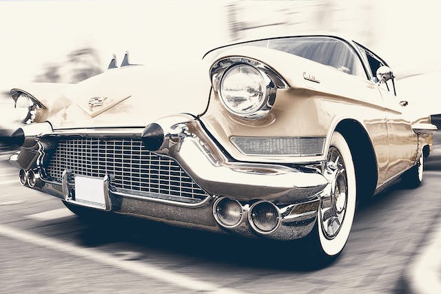
In 1957, the Cadillac emblem had a long, low, and wide shape to emphasize the pattern of advertising during those days. This design continued through 1959 until the crown at the top of the logo almost vanished. During the beginning of the new century, a new wreath and crest logo was introduced at the Pebble Beach Concours d’Elegance. The logo underwent a huge makeover with the removal of the crown and the birds, the extreme widening of the crest, and the complete removal of the wreath.
The present logo was inspired by Piet Mondrian, a European geometric painter which was able to keep the logo’s heritage and shape but also managed to give it a modern look.
